
Revised BAHDFOG card


#17
 12-06-2002, 02:46 PM

Senior Member
Join Date: Sep 2001
Location: Week-Philly, Weekend-Dirty Souf Jerz
Posts: 7,861
Likes: 0
Received 0 Likes
on
0 Posts

#18
12-06-2002, 05:13 PM

Senior Member
Join Date: May 2002
Location: Livermore, CA
Posts: 705
Likes: 0
Received 0 Likes
on
0 Posts
4WL HOGG, lookin better all the time. It sounds like we are ok with the bar and shield and that's cool since I really like it. I agree with HD356 that the flames showing behind take the focus away from the logo.
I like ChesterC's idea where we try to make it a metal color like brushed satin or something so it looked real. Maybe we are going too far with it but you did ask for opinions.
ChesterC, the website sounds great. I'm sure you all can do a better job than little ol me. Are we going to register the domain name or is it already taken?
If there is anything I can offer I'd be more than happy to help just let me know.
Sounds like we are off to a good start!!
#19
12-06-2002, 05:39 PM

Join Date: Aug 2002
Location: Wishing I was in my Truck. Benicia, CA
Posts: 248
Likes: 0
Received 0 Likes
on
0 Posts

Made it an orange background, and all the text in the badge (and the badge itself) sort of 3D.
H356, the blurry stuff happens when I post the image onto my gallery. I have done all the drawing on the Microsoft Paint on my computer and there is no disfiguring on that file.
I am going to have to make the letters from scratch if we want metal bolted block lettering.
Problem with getting too detailed is that this is going to be a business card about 2" by 3.5". This image is a little bit larger than that.
#20
12-06-2002, 05:48 PM

Member
Join Date: Nov 2002
Location: Pleasanton, Cali
Posts: 33
Likes: 0
Received 0 Likes
on
0 Posts
Nice, the card is looking badass! The only thing i can see is that a) yea the Built Ford Tough lettering would be dope, and b) the top of the badge maybe not coming to such a steep point, looks a bit misshapen and goofy to me.
Great job so far though! I like the new color scheme!
Chester, if u need help with the webpage, id be happy to help out.
Great job so far though! I like the new color scheme!
Chester, if u need help with the webpage, id be happy to help out.


#22
12-06-2002, 10:44 PM
Senior Member
Join Date: Sep 2001
Location: Week-Philly, Weekend-Dirty Souf Jerz
Posts: 7,861
Likes: 0
Received 0 Likes
on
0 Posts
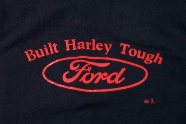
1JT, do ya happen to know if there's anywhere i can get that shirt? i emailed their website and never heard back from them
anyway, i'll get some pics of the shirts tomorrow. my internet went out and wasn't expecting it to come back on until tomorrow, so i said forget about it for now, but it came back on, but too late to do it now
I printed out a card and delted the flames and drew a little something. i'll scan it tomorrow and post that. It may be a little overkill, but you guys may like it.
Just a question, not sure if this matters to you guys cuz it is your group, but isn't it a little monotonous to have BAHDFOG in the bar, then "truck owners" in the shield?
wouldn't it almost be read as "Bay Area Harley Davidson F150 Owners Group Truck Owners"? Just seems a little weird if you translate the BAHDFOG out. Just a thought
Maybe change Truck Owners to North California, or West Coast, or something?
the new font looks good though
#23
12-07-2002, 01:25 PM
Senior Member
Join Date: May 2002
Location: Livermore, CA
Posts: 705
Likes: 0
Received 0 Likes
on
0 Posts
#24
12-07-2002, 05:44 PM
Senior Member
Join Date: Sep 2001
Location: Week-Philly, Weekend-Dirty Souf Jerz
Posts: 7,861
Likes: 0
Received 0 Likes
on
0 Posts


#25
12-07-2002, 05:45 PM
Senior Member
Join Date: Sep 2001
Location: Week-Philly, Weekend-Dirty Souf Jerz
Posts: 7,861
Likes: 0
Received 0 Likes
on
0 Posts


#26
12-07-2002, 05:48 PM
Senior Member
Join Date: Sep 2001
Location: Week-Philly, Weekend-Dirty Souf Jerz
Posts: 7,861
Likes: 0
Received 0 Likes
on
0 Posts
maybe you could put a little saying on the card? Just take a ford one and give it a twist so you can use it. Like on the 03 Kansas City shirt it says "Born in Milwaukee, Dressed IN kansas city", but the official ford saying was "Born in Detroit, Dressed in Milwaukee". They just changed it around to fit their shirts, and make it legal.
here's another ford saying, maybe you can twist this one around
(incase you can't read it, it says "born wild and free since 1903"

Also, here's a 2002 Build Team hat where they changed the logo around

I don't think you guys will have any trouble with your logo. Hope these help some
here's another ford saying, maybe you can twist this one around
(incase you can't read it, it says "born wild and free since 1903"
Also, here's a 2002 Build Team hat where they changed the logo around
I don't think you guys will have any trouble with your logo. Hope these help some
#27
12-07-2002, 05:54 PM
Senior Member
Join Date: Sep 2001
Location: Week-Philly, Weekend-Dirty Souf Jerz
Posts: 7,861
Likes: 0
Received 0 Likes
on
0 Posts
anyway, i hope you guys don't mind, but i thought your flames could use some spicing up. More of a traditional and HD flame look. A little overkill probably for such a small business card, but they can be tuned down alot if you went with something more along this design.
I printed out a pic of the card and just drew them freehand cuz i can't draw them on my computer with a mouse, but it gives ya an idea. LoL. i'm sure if you wanted to go wtih a more traditional flame look you could find a pic of some flames you liked online or on a truck and upload them and get them on the card. i just drew these to give you guys an idea.
another option would be to forget the flames in the backround all together, and just use a scaled down image of the 02 HD flames and use it as a border across the bottom, or across the bottom and one side of the card. i could photoshop this up if anybody wanted to see.
just trying to give you guys some other options
outlined flames

shadowed flames

I printed out a pic of the card and just drew them freehand cuz i can't draw them on my computer with a mouse, but it gives ya an idea. LoL. i'm sure if you wanted to go wtih a more traditional flame look you could find a pic of some flames you liked online or on a truck and upload them and get them on the card. i just drew these to give you guys an idea.
another option would be to forget the flames in the backround all together, and just use a scaled down image of the 02 HD flames and use it as a border across the bottom, or across the bottom and one side of the card. i could photoshop this up if anybody wanted to see.
just trying to give you guys some other options
outlined flames
shadowed flames
Last edited by Harley#356; 12-07-2002 at 06:00 PM.
#29
12-08-2002, 11:34 AM
Senior Member
Join Date: Sep 2001
Location: Week-Philly, Weekend-Dirty Souf Jerz
Posts: 7,861
Likes: 0
Received 0 Likes
on
0 Posts
#30
12-09-2002, 06:39 PM
Join Date: Aug 2002
Location: Wishing I was in my Truck. Benicia, CA
Posts: 248
Likes: 0
Received 0 Likes
on
0 Posts
This one is pretty different than the others.

I put some wings on the logo (Had to shrink it down though). I also changed the flames to something a little more "sleek".
Now the words inside the shield say "West Coast" a little bit more logical, I guess
Keep the input coming (although at sometime I am going to have to actually settle on a design).