

Revised BAHDFOG card


Senior Member
Joined: Sep 2001
Posts: 7,861
Likes: 0
From: Week-Philly, Weekend-Dirty Souf Jerz
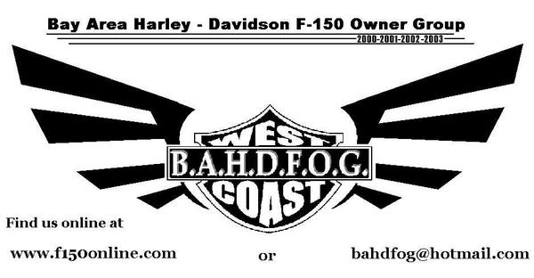
Lookin better. I say just make that center logo a little bigger and more centered, even if it over laps the wings.
and maybe change the web and email font to something different to spice it up more

and maybe change the web and email font to something different to spice it up more


Senior Member
Joined: May 2002
Posts: 705
Likes: 0
From: Livermore, CA
I don't think I like the wings. I like the revision to West Coast though. I think shrinking the emblem makes it lose focus. It should be the focus of the card. Perhaps making the wings smaller and the emblem bigger would be better...or lose the wings altogether in my opinion.


Thread Starter
|
Senior Member
Joined: Aug 2002
Posts: 248
Likes: 0
From: Wishing I was in my Truck. Benicia, CA
Alright, I got three more.
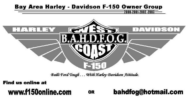
I really want to hear the Nor Cal guys input. They are the ones who are going to be getting these.
Everyone else should tell me whether or not you would check us out if you found this on your windshield, or someone handed it to you
I really want to hear the Nor Cal guys input. They are the ones who are going to be getting these.
Everyone else should tell me whether or not you would check us out if you found this on your windshield, or someone handed it to you
Senior Member
Joined: Sep 2001
Posts: 7,861
Likes: 0
From: Week-Philly, Weekend-Dirty Souf Jerz
even though you don't want to hear my input ")
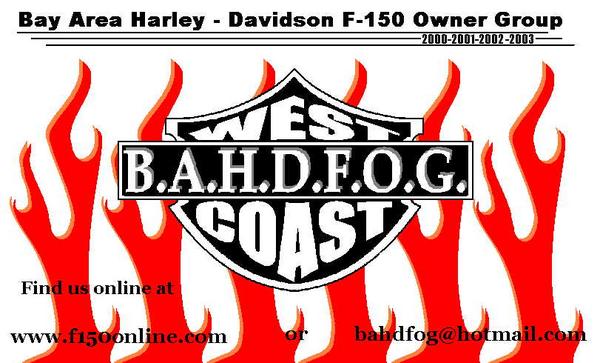
 The 1st one looks the most professional or whatever. just needs some more color. the flames look cool, but still need some work. but its up to you guys
The 1st one looks the most professional or whatever. just needs some more color. the flames look cool, but still need some work. but its up to you guys
Thread Starter
|
Senior Member
Joined: Aug 2002
Posts: 248
Likes: 0
From: Wishing I was in my Truck. Benicia, CA
Not that I don't want your input, Josh, it is just that I would like to hear from the local guys the most.
What do you think of the Slogan:
"Built Ford Tough . . .With Harley-Davidson Attitude." ???
What do you think of the Slogan:
"Built Ford Tough . . .With Harley-Davidson Attitude." ???
Senior Member
Joined: Sep 2001
Posts: 7,861
Likes: 0
From: Week-Philly, Weekend-Dirty Souf Jerz
i know, i was only messin with ya 4wl.
i wish the east coast guys were as active as you's. I'd like to design up a card also, but it would take forever cuz they don't get on the site too often.
anyway, i think that saying's pretty cool. i like the font on it.
i wish the east coast guys were as active as you's. I'd like to design up a card also, but it would take forever cuz they don't get on the site too often.
anyway, i think that saying's pretty cool. i like the font on it.

Senior Member
Joined: Oct 2001
Posts: 549
Likes: 0
From: FFW-CA Tough Truck Winner


Member
Joined: Nov 2002
Posts: 33
Likes: 0
From: Pleasanton, Cali
WOW!! LOVE the first one...maybe make the shield orange? or outline the shield and the wings in orange. The slogan is aight..sounds a bit cheesy tho. Maybe like Built Harley Tough or...Born with Ford, perfected with Harley...something to that extent, i dunno. But seriously, i love the first card, just delete the other two right now!
Senior Member
Joined: Sep 2001
Posts: 7,861
Likes: 0
From: Week-Philly, Weekend-Dirty Souf Jerz
maybe change the years up top from 00,01,02,03 to 1903-2003, and maybe right something about 100 years?
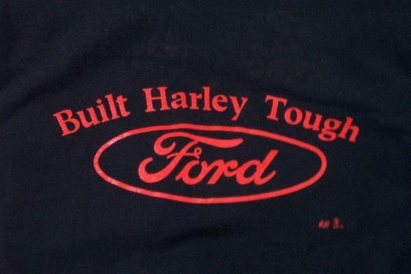
 the back of the kansas city 02 build shirts
slogan is aight..sounds a bit cheesy tho. Maybe like Built Harley Tough or
the back of the kansas city 02 build shirts

